Stranger Things Series - Reflection, 12"x30", oil on canvas

I've decided to start a series of paintings based on the show, "Strange Things". I'm a huge fan. It has the look and feel of my childhood, with hints of Goonies, Close Encounters, Stand By Me, etc... Everything that I loved.

Below is the initial sketch, and finished piece, of the first painting in the series titled, "Reflection", 12"x30", oil on canvas. It portrays Eleven entering the Upside Down, but if you've see the show, you already knew that :) I hope you enjoy the show as much as I do, and the paintings as well. More to come.

-Steve

New Jazz Inspired Paintings

About two weeks ago, I decided to do two new paintings inspired by Jazz. Here's a look.

Take 5 - 22"x28", oil on canvas

They are both painted in oil, and both of famous jazz musicians, but that's about the only thing they have in common. The first painting titled "Take 5", is based off of photo I found online of the Dave Brubek Quartet, playing a set in North Carolina in 1966. I originally painted this in black and white only, and then used a blue glaze to give it that classic Blue Note feel. Here's a peek at it before the glaze...

The second painting is a portrait of John Coltrane. 

Coltrane - 30"x40", oil and acrylic on canvas

This was very much experimental for me. I chose to use a flat red ground, which I painted in acrylic, and used that red as a substitute for black. Needless to say, this kind of messes with your brain! Especially when the 50% grey, that I chose as the darkest color in the painting, is actually darker than what would really be the darkest color... black. It was almost like half painting normally, and half of the time thinking in terms of a photo negative. I also wanted to experiment with painting much more loosely and "painterly". This painting has lots of scumbling, a little pallet knife, and very distinct brushstrokes. The technique is much different than the smoother toned Take 5 painting. I also noticed, to my surprise, that the Coltrane painting looks a lot more interesting when hanging on the wall. The red tends to trick your eye into thinking it's actually black, especially at a distance. Maybe the human eye knows it's "supposed" to be black, and switches the colors unintentionally? I'm not sure, it's pretty interesting though. I'll definitely put that in the memory banks for another time.

Anyway, I hope you enjoy them. I'll be trying to get higher resolution images up in the painting section soon.

Impossible Link To The Past: Inspired by Reutersvard

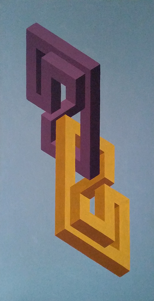
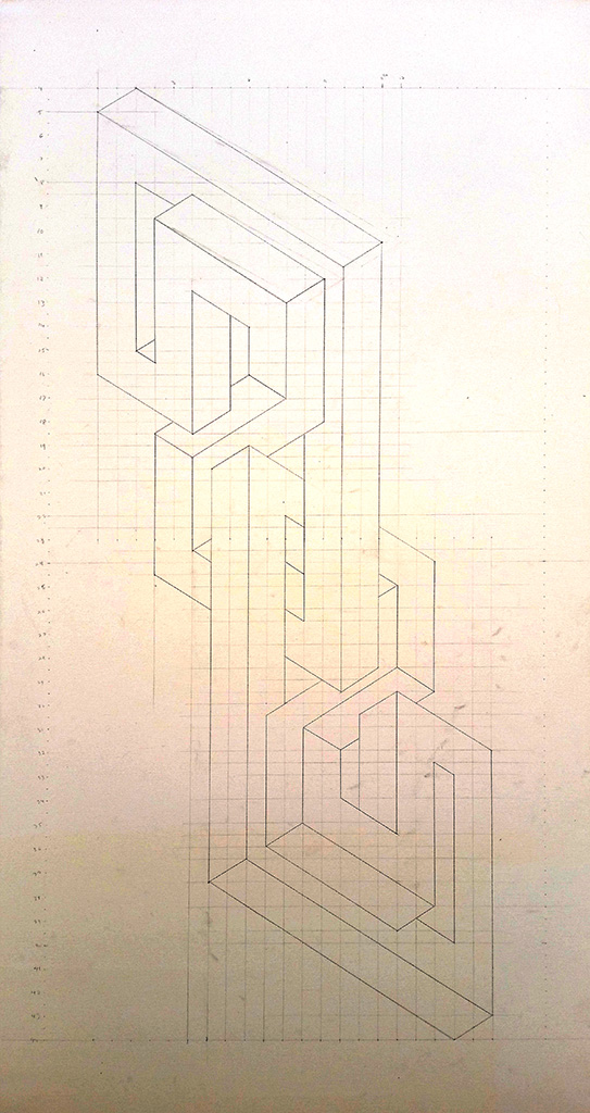
Last weekend I started a new painting based off of the impossible designs of Oscar Reutervard. This is one of the first paintings that I've created using my own "impossible design". My process began with an initial sketch (not pictured), and then I moved on to recreating the design on the computer (pictured). As well as this type of drawing really messing with my head while I tried to conceive it, the biggest step was figuring out the scale of the grid in order to produce the design for the canvas dimensions (in this case 24" x 48").  After that was determined, I carefully drew the grid and design onto the canvas(pictured). The next step was choosing the color scheme, in this case I chose a complementary scheme using mustard and plum, and decided on an airy dulled out blue to give the impression of a sky and depth, while keeping the color flat in order to not detract from the foreground design.

For those of you not familiar with Reutervard's work, I strayed slightly from what I have determined to be his "rules". From what I have seen of his work, he never allows his drawings to show more than three surface planes, meaning every plane of every object in his drawings live in the scene together on these planes. By inverting the two objects, I have purposely created a fourth plane... I like to break the rules a little and see what happens. If you look at the painting as two separate designs, they individually abide by this three plane rule. But, if you look at it as a whole, I used four. They each have a left and right plane. The mustard design has a bottom plane but, no top. While the plum design has a top plane but, no bottom. Does that make sense?

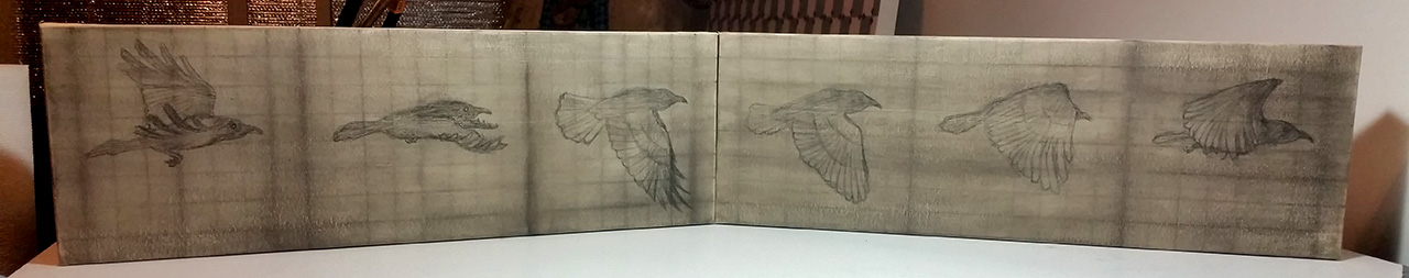
Also, I realize these pictures are not of the highest quality. I like to take process pictures with my phone while I progress through a painting, specifically for this blog.  I'll have some higher resolution pictures added to my gallery at the end of this week.

I hope this little insight has been helpful.

-Steve